The 9 Most Overlooked Pages in Ecommerce and Why They Matter

Quick Summary Behind every great eCommerce experience are pages most people overlook. This blog explores nine critical pages where leading brands seize hidden opportunities to improve CX and performance.
Most eCommerce teams prioritize optimization where the data is loudest. Homepage traffic, product page engagement, cart abandonment, and checkout conversion dominate reports and inform roadmaps..But just beneath that surface lies a layer of overlooked digital real estate that may be quietly stalling conversions, damaging brand perception, and leaving customer lifetime value (CLTV) on the table.
For enterprise brands and high-growth retailers, the game isn't just about improving the obvious. It's about mastering the entire journey, including the moments that don't get weekly reports.
Below are the most overlooked eCommerce pages, with practical strategies for turning them into powerful growth levers.
Zero Search Results Page
What happens when a customer searches for “black leather duffel” and your site returns nothing? For many brands, the fallback is a default “no results found” message: a digital shrug that assumes the customer will refine their search, browse elsewhere, or simply give up.
When a customer searches for something specific and finds nothing, it is not just a dead end. It is a lost sale, a broken experience, and a missed signal. Most eCommerce teams focus on optimizing high-traffic pages, but zero-results moments are rich with intent. These shoppers are not browsing. They know what they want and they are telling you directly. A smart zero-results page does not just apologize. It responds. It guides. It recovers. Treating these pages like strategic assets instead of empty gaps can mean the difference between bounce and conversion, frustration and loyalty.
Best Practices:
Offer autocomplete and typo correction.
Use this moment for guided discovery, including displaying trending products, curated collections, or top searches.
Add a CTA to contact support or chat (“Didn’t find what you’re looking for?”).
Use the data to feed your merchandising strategy and product gaps.
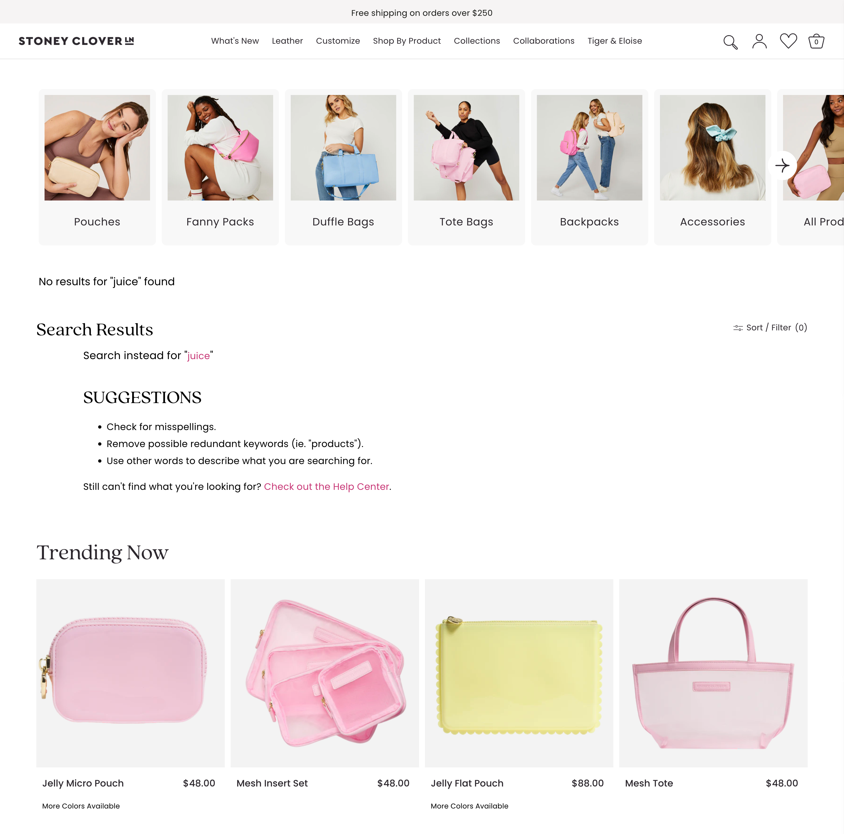
Stoney Clover Lane turns failed searches into guided exploration. Instead of a dead-end message, their zero-results page features clickable category blocks that encourage continued browsing and discovery. It’s a playful, branded experience that keeps the customer journey alive.
Every failed search is an insight. Every “no results” moment is a rescue opportunity.
The Lookbook or Campaign Page
You’ve invested tens or even hundreds of thousands in seasonal shoots, styling, and creative direction. But too often, the campaign or lookbook page ends up as a static gallery with a soft call to action. That is not storytelling. It is a missed opportunity to engage, inspire, and convert.
Lookbooks should function as immersive, branded experiences—shoppable, intuitive, and emotionally resonant. They bridge the gap between creative vision and customer action, allowing users to explore the narrative behind the collection. For fashion, lifestyle, and luxury brands, these pages are more than visual showcases. They are strategic assets that elevate the brand and drive performance.
Best Practices:
Create editorial-style layouts: Mimic the structure of high-end fashion magazines or campaign microsites.
Make every asset shoppable: Use hotspots, in-image linking, or overlays.
Layer in context: Include styling tips, design notes, or creative direction blurbs.
Include embedded video or motion assets: Movement adds energy and focus.
Give it a lifecycle: Build anticipation with a “Coming Soon” state and archive older lookbooks into a “Campaign Library.”

La Ligne brings editorial polish to their campaign pages. Rotating hero images showcase the collection, with shoppable products listed below and tools to filter and sort. They also offer a dedicated Stories page that features all campaigns in one editorial-style hub for easy browsing.
The Press or “In the News” Page
Trust is everything in modern commerce. User reviews build credibility from real customers, but third-party recognition often carries equal weight. When validation comes from respected publications, cultural icons, or award programs, it signals authority and momentum.
Yet most Press pages are neglected. A scattered logo grid. Outdated mentions. No context, no narrative, no connection to product. This page should not be treated as leftover PR. It is a trust signal. It tells new customers that people with influence are already paying attention—so they should too.
Best Practices:
Use real excerpts or quotes: Not just logos. Pull in the headlines, blurbs, and journalist POVs.
Add context for each placement: “Named Best Cleanser of 2025 by Allure” or “As seen in GQ’s Travel Edit.”
Organize by relevance: Sort press hits by product, category, date, or vertical (e.g., “Sustainability Features”).
Link directly to products: “Shop the jacket Esquire called ‘essential for fall’.”
Include visual assets and awards: Leverage digital badges, TV segments, or red carpet moments.
The Back-in-Stock Landing Page
Back-in-stock notifications create urgency and tap into pent-up demand. The open and click are not the challenge. The problem is what happens next. A generic product page with no acknowledgement kills momentum.
That moment is far more powerful than most brands realize. A restock is not just a logistical update. It is an emotional payoff. It represents demand, loyalty, and anticipation. The landing page should reinforce that. It should feel deliberate. It should include messaging that validates the customer's return, product badges that highlight the restock, and urgency drivers that remind them how quickly it may sell out again. This is not a routine interaction.
Best Practices:
Announce the return clearly: Use badges like “It’s Back” or “You Asked. We Listened.”
Create a dynamic Back-in-Stock hub: Showcase recently returned favorites, most-waitlisted items, and restocked bundles.
Layer on urgency: “Selling Fast Again,” “Back Today, Gone Tomorrow,” or show live inventory counts.
Include social proof: “3,418 shoppers waited for this restock.” Testimonials or past reviews can seal the deal.
Enable quick add or auto-select sizes: Friction kills momentum—streamline this flow to be one-click-ready.
The Order Tracking Page
This is one of the most visited pages after checkout, and yet it is one of the most ignored. Most brands drop in a generic carrier widget and call it done. That handoff feels cold. It breaks the brand experience at the exact moment trust should be reinforced.
The customer just paid. They are coming back to see what happens next. This page should not feel outsourced. It should feel owned. It should offer real updates, reflect your brand, and keep the experience alive. If this moment is handled with care, it builds confidence. If it is treated like a utility, it becomes a risk.
Best Practices:
Make it feel native: Use your fonts, colors, copy, and imagery—not a third-party portal.
Include shipment status visuals: “Your order has shipped. Estimated delivery: July 11.”
Offer dynamic recommendations: “While you wait…” paired with cross-sells or UGC.
Add unboxing tips or product care guidance.
Display expected delivery ranges with carrier-specific updates.
The Contact Us Page
Why it matters: The Contact page is where the calm surface of eCommerce breaks. This is where the stress of delayed shipping, faulty discount codes, or wrong items arrives at your door. The user may be angry. They may be anxious. Either way, this page carries tension, and how you handle it defines the experience.
A strong Contact Us page is part of the trust-building flow. It should not feel clinical. It proves there are humans behind the brand, not just bots and automations.
Best Practices:
Segment contact paths: Support, wholesale, partnerships, press, returns.
Add live response times: “Our team typically replies within 1 business day.”
Show your team or HQ: A photo of your office, a team member’s name, or even a message from support humanizes the brand.
Embed search or chat tools: Reduce friction before a user even sends a message.
Reinforce other help options: Links to FAQs, order tracking, or store locations.
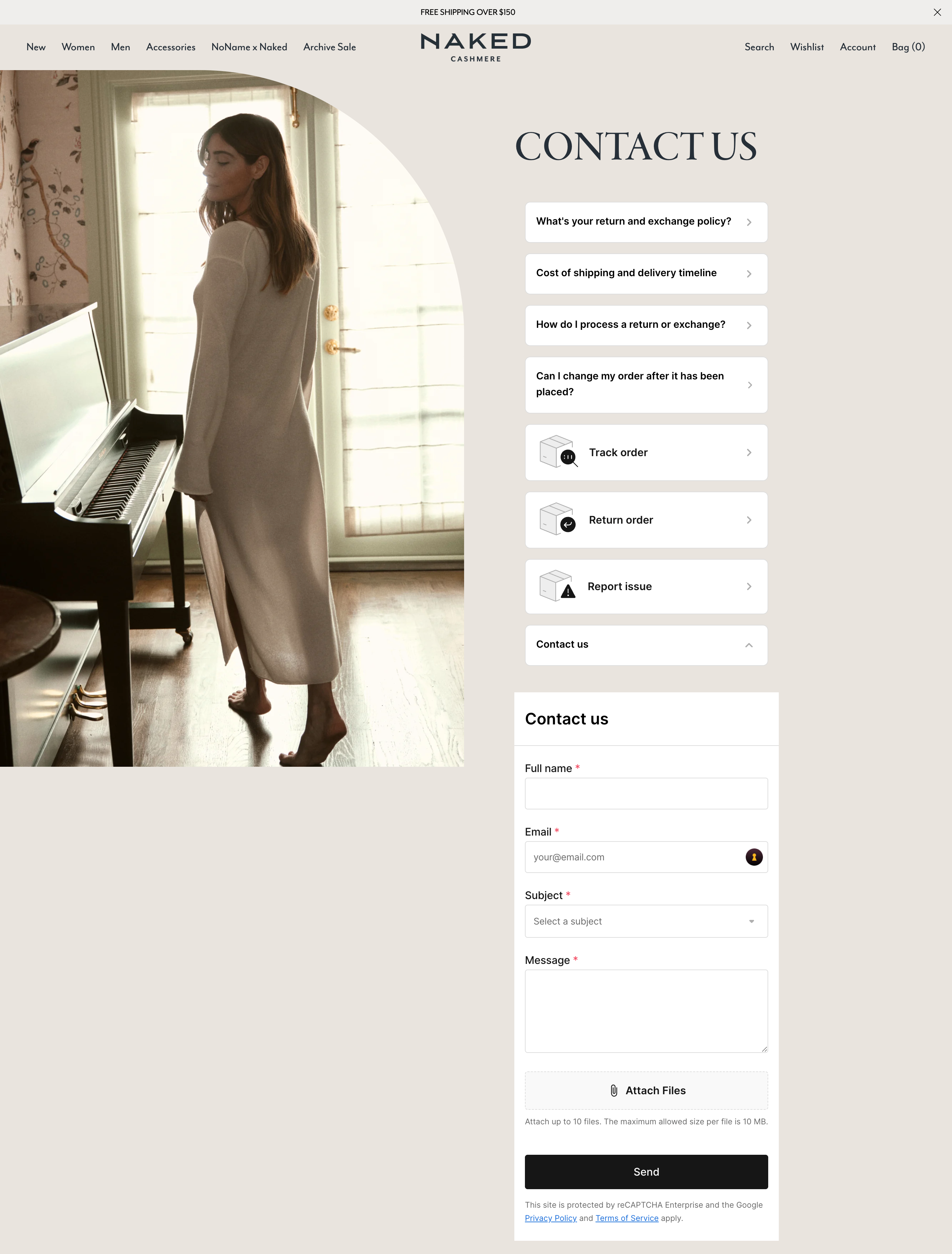
Naked Cashmere makes their Contact Us page feel supportive and not transactional. Users can choose U.S. or international help paths, track orders, start returns, or report issues without filling out a form. Clear options and upfront answers reduce friction and keep the experience calm and customer-first.
The 404 Page
Every 404 visit is a signal of intent. Someone clicked to shop, revisit a product, follow a link, or explore your brand. They expected to land somewhere, and instead hit a wall. Most sites treat this as a system error. But in reality, it's a high-friction moment that exposes how well your brand handles detours.
A strong 404 page is not an apology. It is a recovery tool. It anticipates disruption and responds with clarity. It should feel like a continuation of the experience, not the end of it. Search, product suggestions, curated categories, and brand messaging should all work together to redirect attention and rebuild momentum.
Best Practices:
Make the 404 page feel like a continuation of the shopping experience by using full brand styling, strong visuals, and purposeful layout
Direct users back into the purchase journey with clear navigation to high-converting destinations such as core collections, seasonal edits, or limited-time drops
Embed site search with real-time suggestions to give users immediate control over finding the products they came for
Surface product recommendations driven by merchandising rules, trending data, or behavioral signals to re-engage shopper intent
Audit 404 traffic regularly to identify drop-off trends, missed redirects, or legacy content paths that still drive meaningful clicks
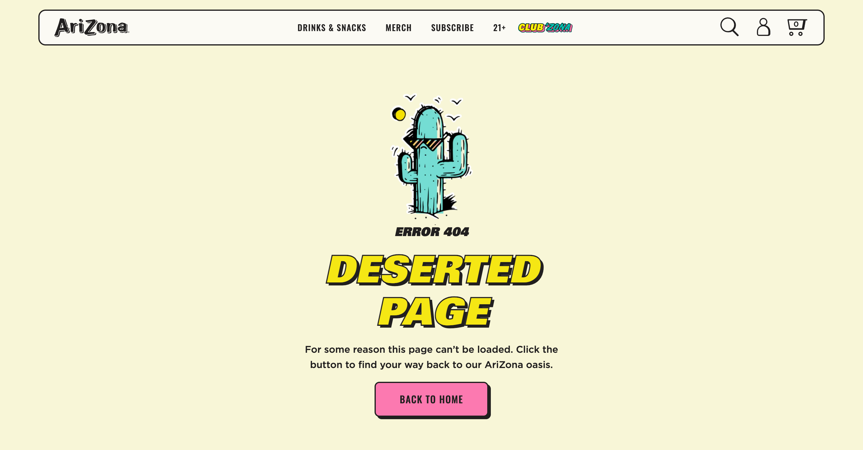
AriZona nails this with a fun, on-brand message: “Deserted Page. For some reason this page can’t be loaded. Click the button to find your way back to our AriZona oasis.” It’s unexpected, it’s on voice, and it helps redirect traffic with personality.
AriZona Teams Up with Avex for a Complete Digital Transformation and a New Membership Rollout
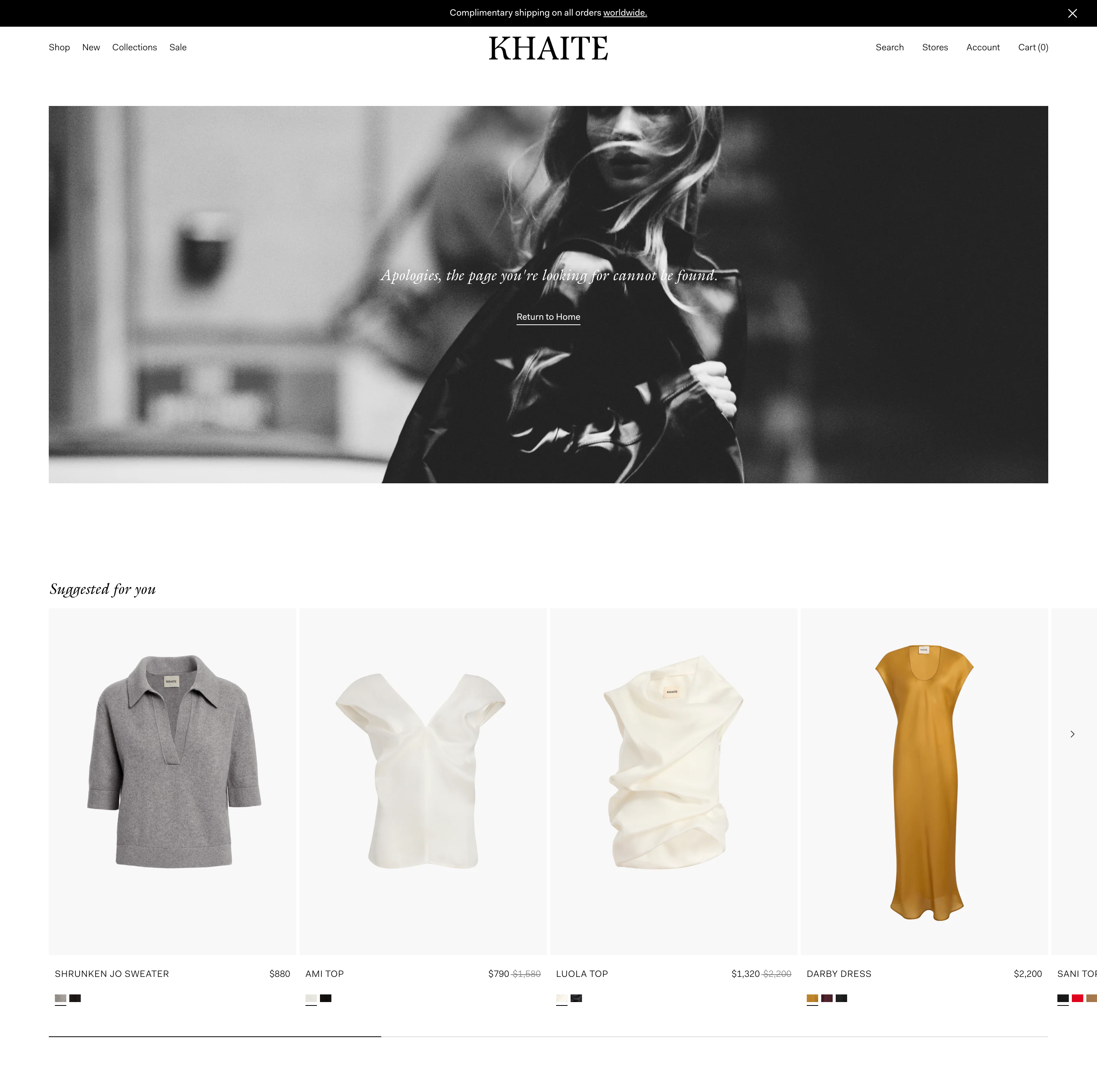
KHAITE takes a more product-forward approach, using their 404 page to recommend curated items and keep the customer journey moving, even when the original path breaks.
The FAQ Index Page
Every eCommerce team wants fewer support tickets, faster resolution times, and smoother conversion paths. The FAQ page can deliver all three, but only if it is built for performance, not just policy. Most brands publish an FAQ once and forget it. The result is a disconnected experience that causes more friction than it solves.
A high-functioning FAQ is updated often. It reflects actual customer questions. It’s clear, human, and aligned with the rest of the site’s UX. It answers what people are really asking, not what the team assumes they care about. This is not documentation. It is experience design.
Best Practices:
Group FAQs by intent: Pre-purchase (shipping, fit, ingredients), Post-purchase (returns, care), Product-specific (“What’s the difference between our Classic and Signature lines?”).
Optimize for mobile UX: Accordions, search functionality, and fast load times are essential.
Embed related PDP links in answers: e.g. “Which shirt is best for hot weather?” → Link directly to bestsellers.
Use video answers when possible: “How to use our serum” or “How to choose your size.”
Make this page SEO-friendly: Structure for searchability around common customer questions.
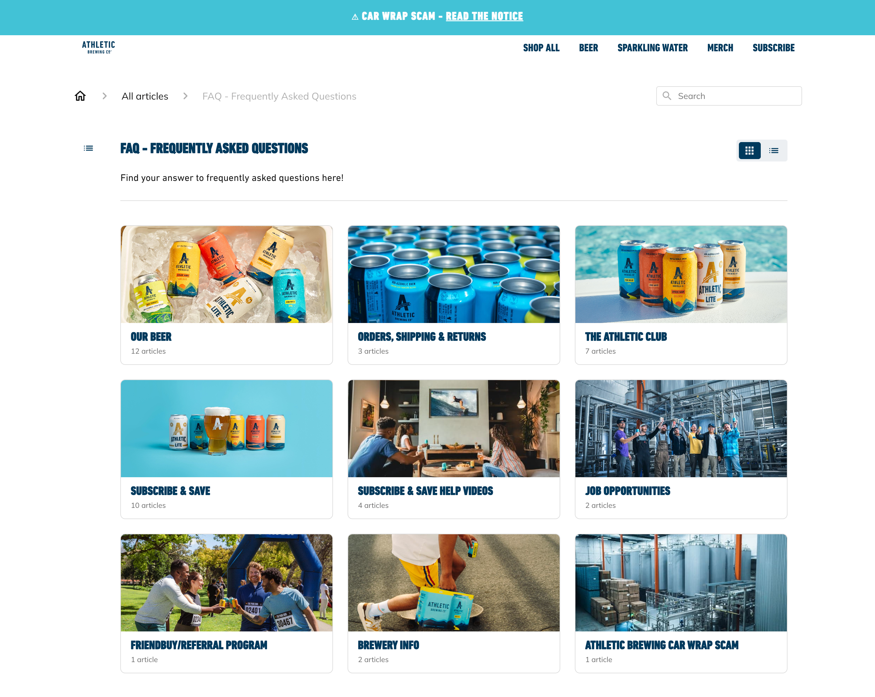
Athletic Brewing structures their FAQ page around real user intent. Questions are grouped clearly by topic, a search bar improves mobile usability, and helpful links guide users to the right next step. If something’s not covered, embedded chat makes it easy to get support without breaking the flow.
Store Locator Page
The store locator is one of the most intent-rich pages on your site. Customers who land here are ready to take action, but the experience is often underutilized. Clunky UX, outdated templates, and generic layouts turn a high-interest moment into a missed opportunity.
Handled well, the store locator becomes a high-converting bridge between digital discovery and in-person experience. It can drive traffic, build trust, and create a seamless handoff across channels.
Best Practices:
Prioritize mobile UX: Most store searches happen on phones. Make maps tappable, directions one-click, and layouts fully responsive.
Surface local inventory and services: Show what’s in stock at each store, from core products to store-only exclusives or upcoming events.
Build with search-first logic: Enable fast location lookup via ZIP, city, or auto-geolocation. Add filters for services, inventory, or store types.
Integrate with omnichannel tools: Offer options like Buy Online, Pick Up In Store or curbside pickup. These reduce friction and turn digital intent into immediate action.
Add merchandising logic: Pair results with “near you” product recommendations, restock alerts, or regional promos to personalize the journey.
This isn’t just a page for finding directions. It’s a conversion touchpoint. One that connects intent to action and digital to real life, all in a few scrolls.
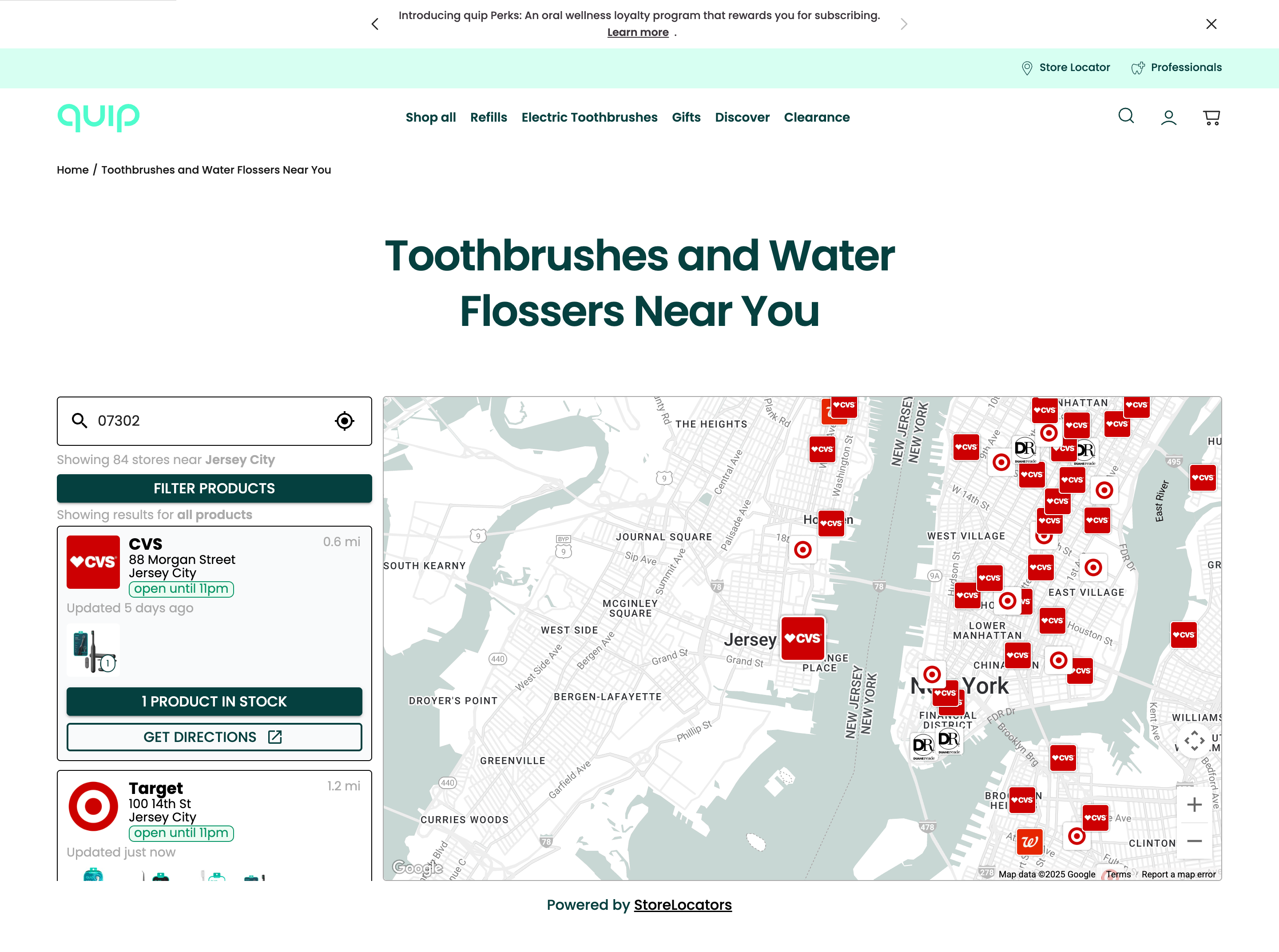
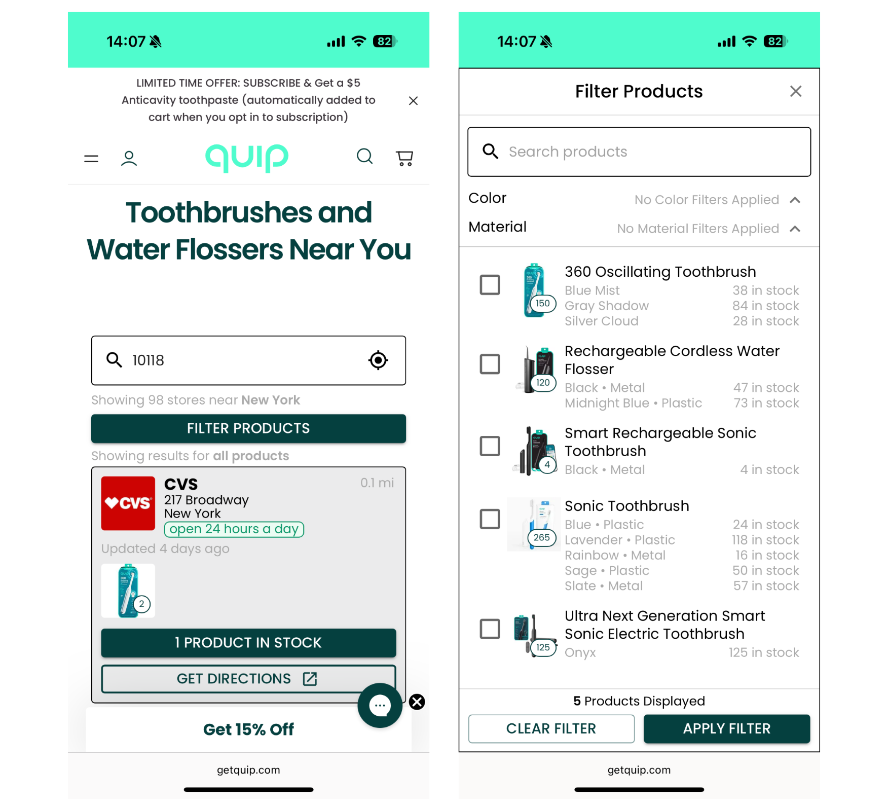
quip’s store locator is built for speed and intent. It adapts layout by device, with a mobile-optimized experience that makes searching on the go seamless. Users can see what’s in stock, filter by product, and get directions, all designed to drive immediate action.
Oral Care Brand quip Engages Avex for Shopify Replatforming and UX Redesign
Treat Every Page Like It Matters
In a landscape defined by rising expectations and fragmented attention, no page is neutral. Every touchpoint either compounds your advantage or quietly subtracts from it. At Avex, we help brands close the gaps. We turn friction into flow, hesitation into confidence, and overlooked touchpoints into high-performing parts of the customer journey. From optimizing the forgotten corners of your site to rethinking how trust is built post-purchase, we focus on the moments that most teams miss.
Get in touch today!