Swift UX Wins: 6 Strategies to Elevate E-Commerce Website Experiences

Quick Summary Take a deep dive into some pivotal UX guidelines, unlocking insights to not only attract initial visitors but also to foster enduring customer loyalty.
In the bustling and competitive digital marketplace, how products are introduced, websites are structured, and users are guided through decision-making processes holds the key to success. Serving as the crucial bridge between brands and consumers, e-commerce brands must prioritize an experience marked by seamless navigation, intuitive design, and overall user satisfaction. This blog is a deep dive into some pivotal UX guidelines, unlocking insights to not only attract initial visitors but also to foster enduring customer loyalty.
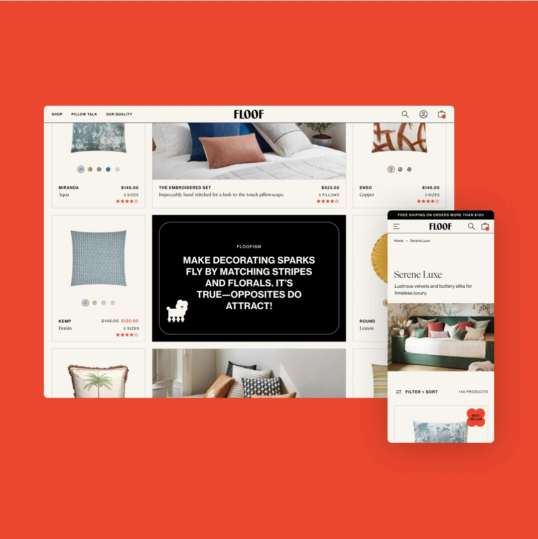
Strategic Implementation of Bespoke Imagery and Design
In the digital landscape, the impact of first impressions cannot be overstated, particularly when users hold the power to abandon a site in the blink of an eye. Within the context of e-commerce storefronts, the utilization of tailored imagery and design surpasses the boundaries of merely elevating user experience. Instead, it becomes interwoven with critical elements such as marketing strategies, advertising methodologies, user demographics, market dynamics, design trends, and beyond.
In practical terms, the significance of sophisticated design goes beyond surface-level visual appeal, playing a central role in shaping perceptions and guiding various aspects of the user journey. Functional or plain images may lead users to underestimate the quality and allure of products, while overly niche design aesthetics can alienate users, discouraging further site exploration.
As a general guideline, employ bespoke homepage imagery that captivates users and showcases products in appealing lifestyle contexts. High-quality photography on homepages sets a positive tone and fosters a favourable first impression. Inspirational product images attract attention and visually represent product categories, contributing to a more engaging and immersive user experience.
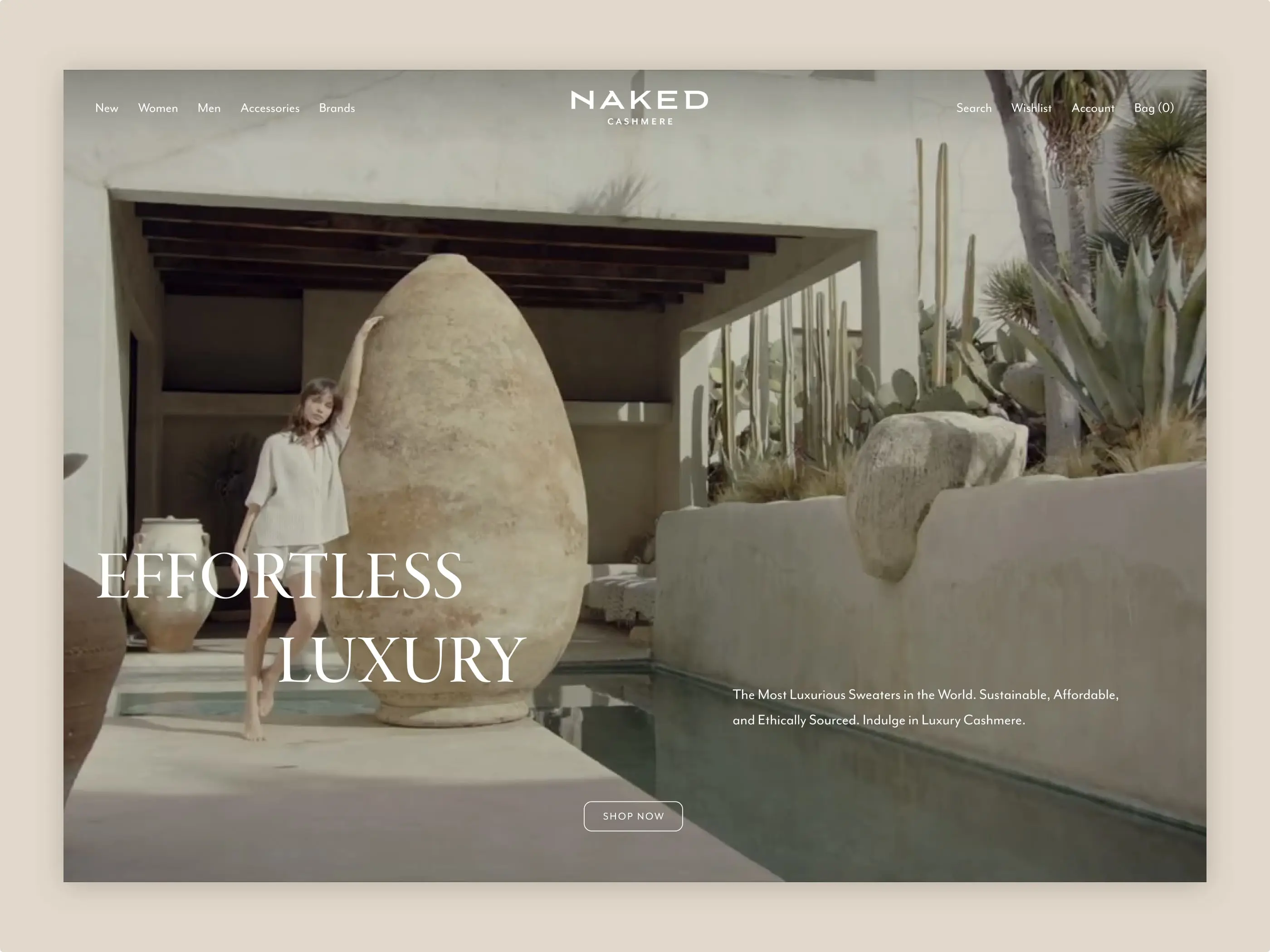
“Cut-out” images, on the other hand, are useful in product lists to highlight product details and are less effective at getting a feel for the site and its brand values.
Certainly, this doesn't imply that a design-forward or visually niche aesthetic can't be a vital component of a successful brand. Any potentially contentious design choices should be regarded within the context of a comprehensive and deliberate brand strategy. This strategy should encompass insights gathered from UX testing, focus groups, or other user feedback to assess overall reactions to the proposed branding and aesthetics. In essence, these decisions should be made with a well-rounded understanding of how they fit into the broader brand narrative and resonate with the intended audience.
Representative Sample of Products on the Homepage
Typically, a brand's homepage serves as the users' initial chance to familiarize themselves with the brand and its products. Many first-time users develop their initial perception of the site's product range by gathering information as they scroll through the homepage. Indeed, in Baymard’s examination of desktop DTC sites, this primary behaviour upon landing on the homepage was nearly a universal trend. This approach served as a means for users to orient themselves and ascertain whether the site presented anything appealing. Consequently, if the homepage provides only a limited glimpse of the product range, many first-time users might overlook the extensive array of offerings, resulting in incomplete perceptions of the site's offerings.
For e-commerce brands, a recommended strategy involves prominently showcasing a diverse range of products and collections directly on the homepage. This not only simplifies navigation but also enables users to quickly discover products that match their interests.
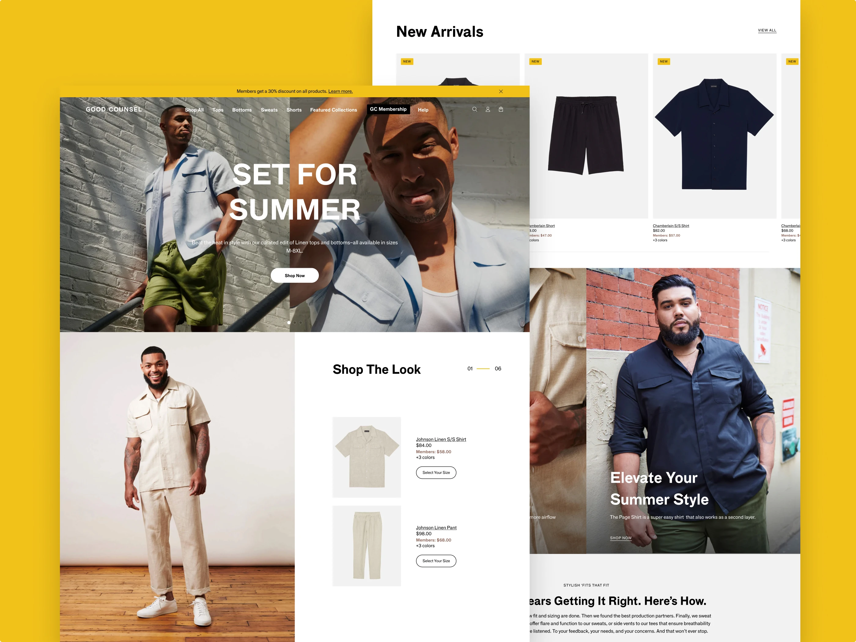
In the case of smaller catalog sites, it is advisable to exhibit a minimum of half the product catalog on the homepage. For brands with a larger product catalog, the goal should be to present at least one product for each product type. This approach ensures a comprehensive representation of the brand's offerings, enhancing the user's initial interaction and encouraging exploration across the entire product range.
Furthermore, integrating product links can effectively highlight best-selling or popular collections, a sought-after navigational path based on DTC testing. Alternatively, some sites may choose to feature new arrivals or products within other curated filters or categories, tailored to the size and scope of the product catalog.
Supplementary Brand and Product Pages
Much like customers engaging in conversations with the owner or employees of a physical boutique store, participants on DTC sites with smaller product catalogs expressed a desire to acquaint themselves with the site before finalizing a purchase decision.
Baymard's exploration of DTC websites featuring relatively smaller product catalogs unveiled a distinctive approach by participants compared to established retail platforms like Target or Amazon. Unlike the mentioned sites, where users typically adopt a neutral stance and base decisions on factors such as product availability, pricing, shipping costs, and return policies, participants on lesser-familiar e-commerce sites exhibited a unique behavioural pattern.
Throughout testing, 62% of participants actively interacted with content unrelated to products or orders on DTC sites. Introductory content, such as "About Us," "Our Story," and "Our Process," emerged as pivotal in shaping customer perceptions of the brand and influencing their decision-making process.
Strategically featuring these details on the homepage and product pages enables e-commerce brands to provide users with a comprehensive understanding of the brand's narrative and the intricate details surrounding product creation. This deliberate placement underscores the significance of transparency and storytelling in nurturing a deeper connection between the brand and users. Such information not only enhances the overall user experience but also contributes to building trust and influencing purchasing decisions, empowering consumers to make more informed and emotionally resonant choices.
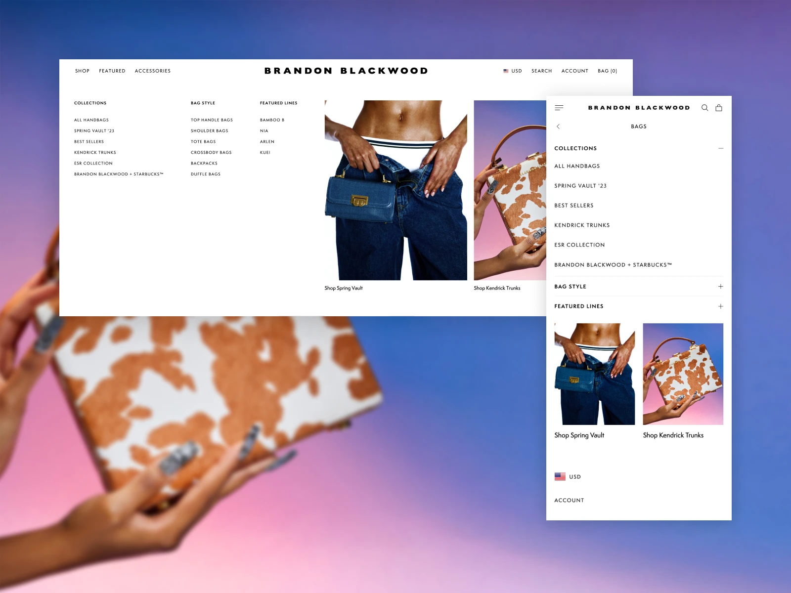
Descriptive and Non-Site-Specific Category Names
Users heavily rely on a website's category options to understand and evaluate the scope of its product offerings. In testing scenarios, participants unfamiliar with a specific site assess its product catalog's diversity and nature primarily through the main navigation options.
When assigning category names, it is essential to avoid industry jargon or brand-specific terms, as new users may struggle to recognize or understand such terminology. Users facing unclearly named categories typically exhibit one of two behaviours: they either avoid these categories, leading to the neglect of essential navigation paths, or explore them through trial and error, resulting in a dissatisfactory experience.
Alternatively, brands could opt for descriptive categories or product names, ensuring consistency in naming categories and subcategories across the entire site.
In instances where site- or industry-specific terms are necessary, especially for recognition among existing users, consider using combined titles that incorporate both the jargon and descriptive words, such as "Dyson Airwrap: Haircare." This not only enhances clarity and streamlines navigation but also contributes to improved SEO friendliness, aligning well with the keywords commonly searched by users.
Diversity-Based “Relevance” as the Default Sort Type
Much like in search, the default sorting order of product lists significantly shapes users' understanding of the category they are exploring. Primarily, most users possess a fundamental need, whether implied or explicit, to verify that they have landed on the correct page before investing considerable time and attention in the quest for relevant products or the application of filters. Failing to establish an accurate perception of the product list's diversity often leads participants to misconstrue the selection as more limited than it is. In practical terms, users might abandon a product category or exit the site altogether if they mistakenly believe that the product assortment lacks options aligned with their preferences.
It is, therefore, advisable for brands to guarantee that the initial 10 to 20 products showcased accurately represent the diversity across all significant product types within the category. This involves setting "Relevance" as the default sorting type and structuring it as a matrix based on diversity.
When incorporating a diversity-driven "Relevance" default sorting method, the strategy may vary depending on the available data and resources. In its simplest form, "Relevance" might mirror a standard "Best Selling" arrangement. For a more sophisticated portrayal of product list diversity, refining the default "Relevance" sorting involves constructing a matrix grounded in product subtypes. This matrix then fine-tunes the display sequence using additional data such as sales rank, user ratings, page views, interrelationships, and more. The specific distribution or priority of these data points is a suitable focus for ongoing multivariate testing and machine learning applications.
Furthermore, the allocation of data points can differ across categories, forming part of the site's personalization initiatives. It adjusts the default "Relevance" sorting based on each user's unique prior actions and purchase history.
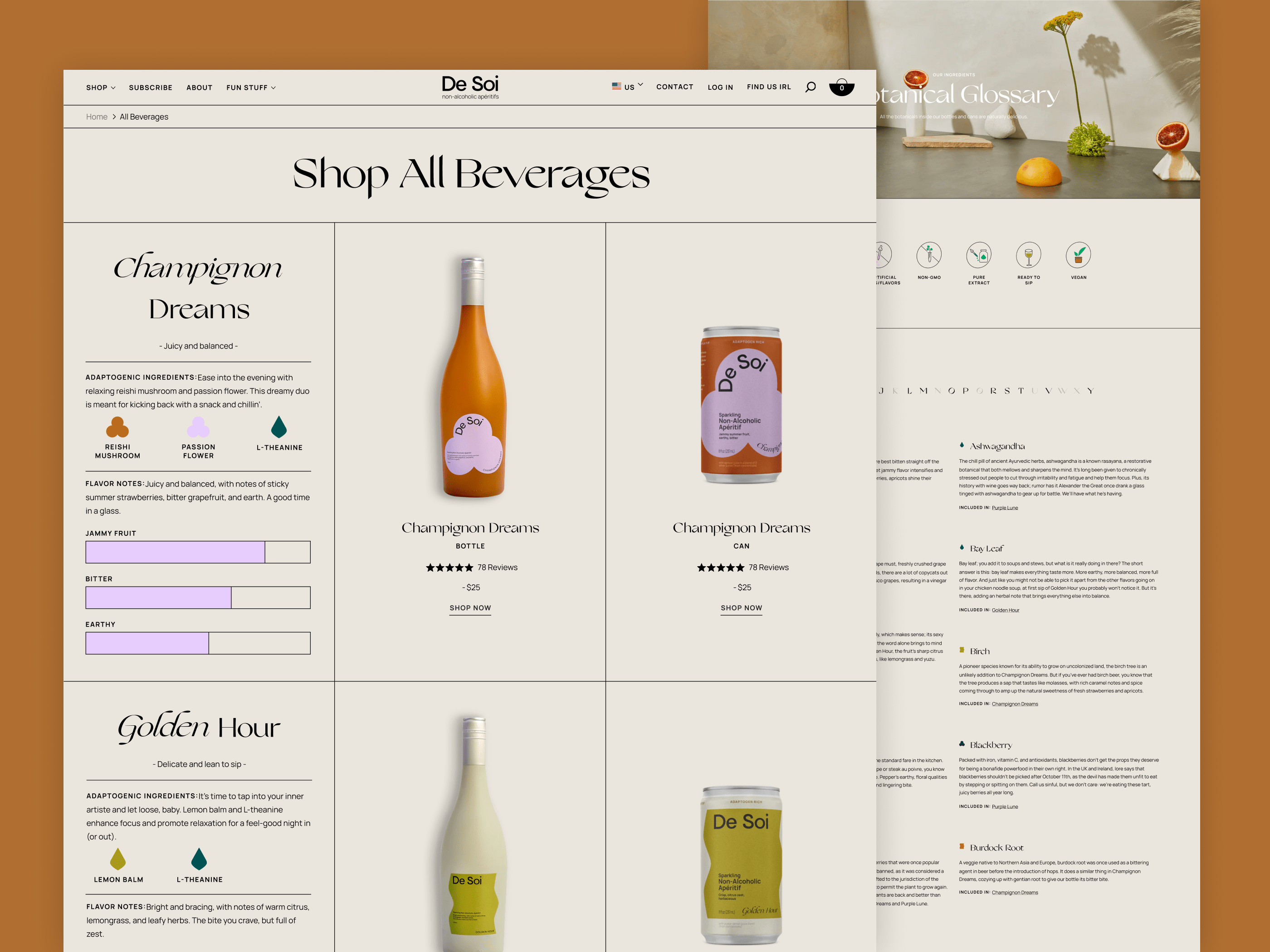
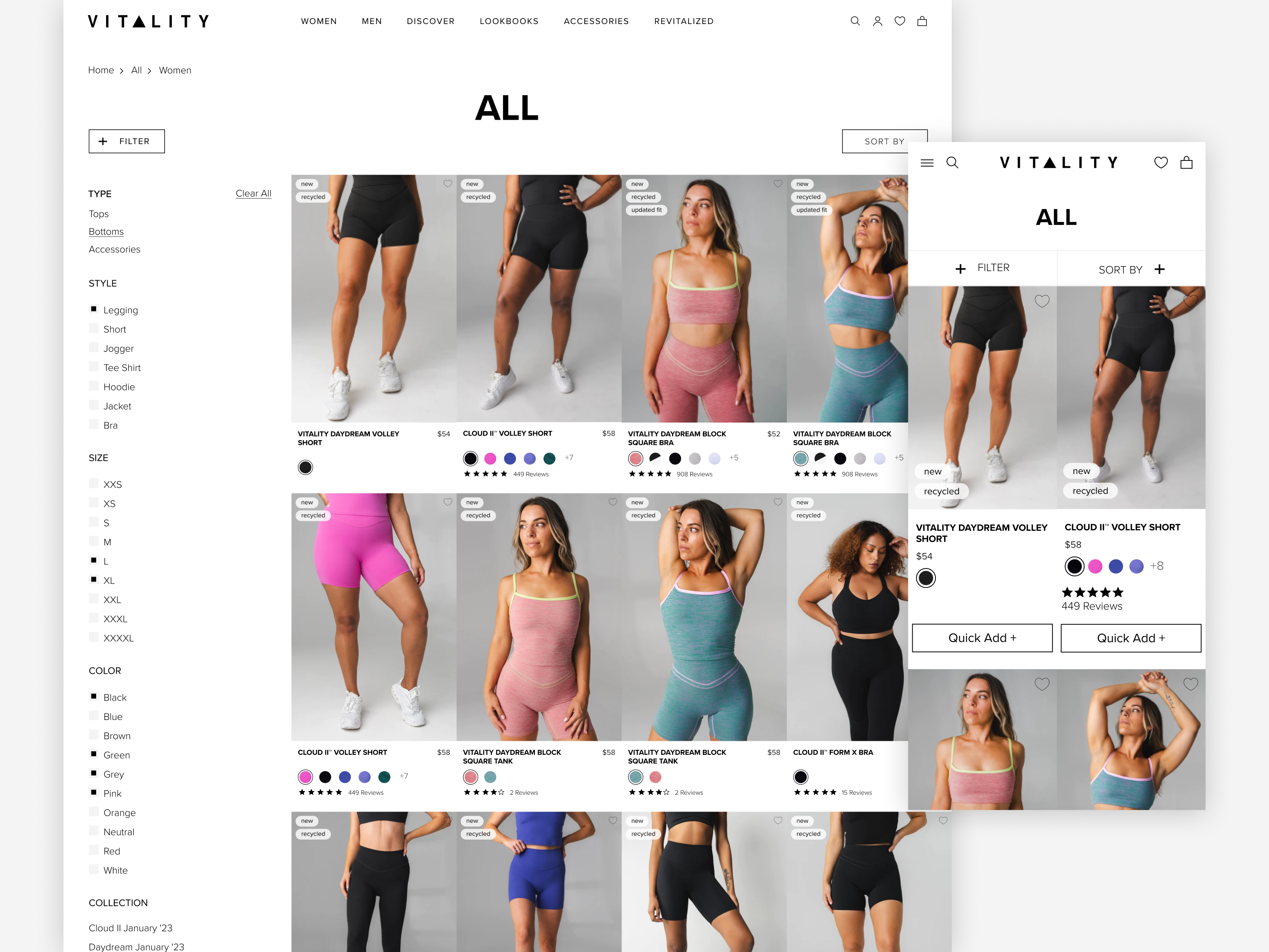
Secondary Thumbnail on Hover
The fundamental objective of product lists is to assist users in quickly and accurately determining which products require further exploration and which ones to disregard. With that said, product thumbnails play a significant role in users scanning through product lists. After multiple rounds of testing done by Baymard, it was observed that when thumbnails didn't provide enough information for participants to evaluate products, those particular products tended to be overlooked.
In scenarios where only one thumbnail is offered for products, users might find themselves with insufficient information, hampering their ability to make a precise judgment on the suitability of the products. Take, for instance, shopping for home decor. Depending solely on a cut-out thumbnail may not provide users with an accurate depiction of how the product complements a lifestyle setting. In contrast, a lifestyle image illustrating the piece's relative dimensions to surrounding furniture offers a more insightful perspective.
To enrich the visual experience for users scanning through list items, activate secondary thumbnails on hover. While primary thumbnails should effectively communicate the product's identity and purpose, maintain a suitable size, and display the quantity in multipack items, secondary thumbnails revealed on hover contribute contextual details and additional visual information for products, ensuring a comprehensive view without overwhelming the collection page.
Regardless of the chosen default thumbnail type, ensuring consistency across the product list for similar product types is essential. The goal is to avoid complicating the comparison and assessment process for users, especially when "Lifestyle" thumbnails attract more attention than "Cut Out" or "Feature Callout" thumbnails. Consistency is key to facilitating a seamless and straightforward user experience, preventing unnecessary challenges in evaluating and comparing products.
In closing, the strategies outlined for swift UX wins are a valuable resource for e-commerce websites aiming to enhance user satisfaction and overall performance. By prioritizing user-centric design and seamless navigation, brands can swiftly elevate the overall website experience and foster brand loyalty.
At Avex, we turn business problems into business value. After launching a high-performing Shopify Plus storefront, we provide e-commerce CRO services that utilize our team of engineers, strategists, UXUI designers, retention specialists & CRO experts to not only address immediate user needs but also lay a foundation for sustained growth and success in the competitive landscape of digital commerce.