Your Shoppers Are Not Behaving the Way You Think: 5 CRO Tests That Prove It

Quick Summary Most brands assume their website is communicating clearly. These five tests prove it usually isn't. Across four brands, the highest-impact changes weren't redesigns or new features. They were precise, data-driven A/B tests: a discount reframed, a message repositioned, two characters removed from a price. Small changes that compounded into millions in incremental revenue.
The eCommerce industry has a habit of overcomplicating conversion rate optimization. Brands chase homepage overhauls and full funnel redesigns while leaving straightforward, high-leverage wins sitting untouched on their PDPs and collection pages.
The tests that generate the most reliable revenue lift aren't always the most complex ones. They tend to be precise interventions grounded in behavioral data: a label rewritten, a UI element repositioned, a discount reframed. Done systematically across a long-running program, those small changes compound into material revenue.
This blog walks through five real tests from Avex's CRO programs, what drove each hypothesis, why the results played out the way they did, and what the findings mean beyond the individual experiment.
How You Frame a Discount Changes Whether People Take It
Client: ALASTIN Skincare | Industry: Premium Skincare | CRO program: 3 years
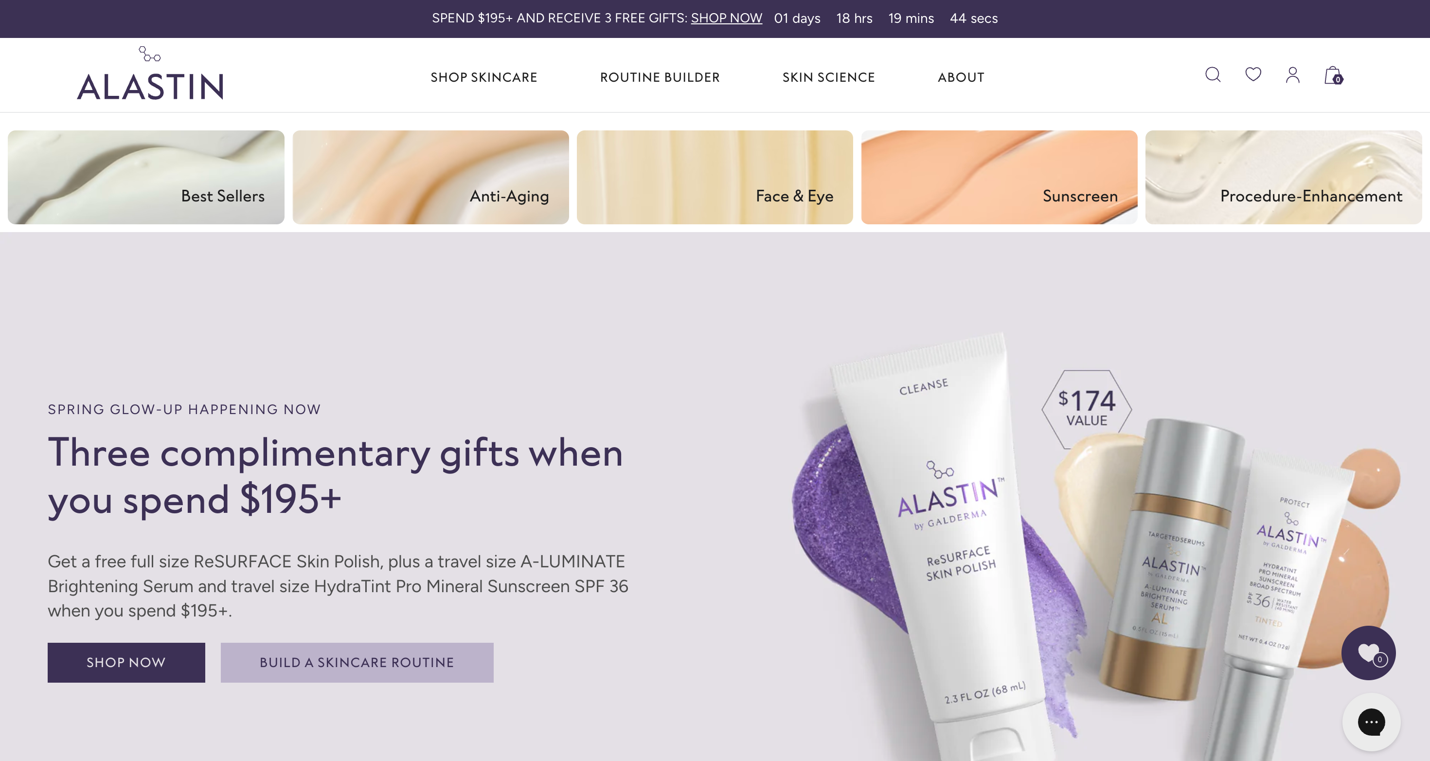
ALASTIN is a physician-grade skincare brand that drives a significant portion of revenue through paid acquisition. With high traffic volume and an active subscription program, their CRO goals were specific: improve overall conversion, grow subscription adoption, and ensure that experiences were personalized by intent level, device, and traffic source rather than applied as blanket changes to the full audience.
The test: Swapping a "5% off" subscription label for "$7.90 off" in the PDP buy box. Same discount, different framing. Targeted at low and medium intent users, who were identified as the segment most likely to need a nudge before converting.
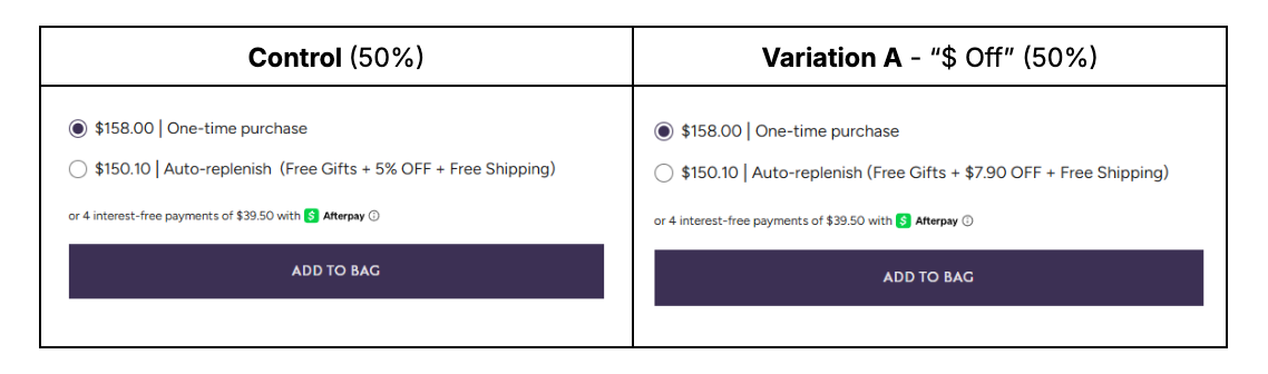
Results:
+18.51% purchases (99% significant)
+16.34% revenue (99% significant)
+21.16% add-to-cart (99% significant)
Why it worked
Percentage-based savings are cognitively abstract. A shopper looking at a $158 product has to do mental arithmetic to understand what 5% actually means. Most don't bother, especially on mobile where attention is compressed and checkout friction is already higher.
Prospect theory tells us that people respond to concrete value signals more strongly than proportional ones. A dollar figure is immediate. A percentage requires a calculation. Reframing the same discount in dollar terms eliminated that friction entirely.
The lift was concentrated almost entirely on mobile users of low and medium intent, exactly the audience most likely to respond to a fast, tangible value cue. Desktop users, who browse more deliberately, were neutral. The experience now runs as a personalized campaign for mobile users at 100%.
The broader principle: The format of a value proposition shapes how it's perceived. For brands with subscription models, where the savings case needs to land quickly, reframing is worth testing before changing the offer itself.
The Right Message in the Wrong Place Gets Ignored
Client: Brio Water Technology | Industry: Water Dispensers and Filtration Systems | CRO program: Under 2 years
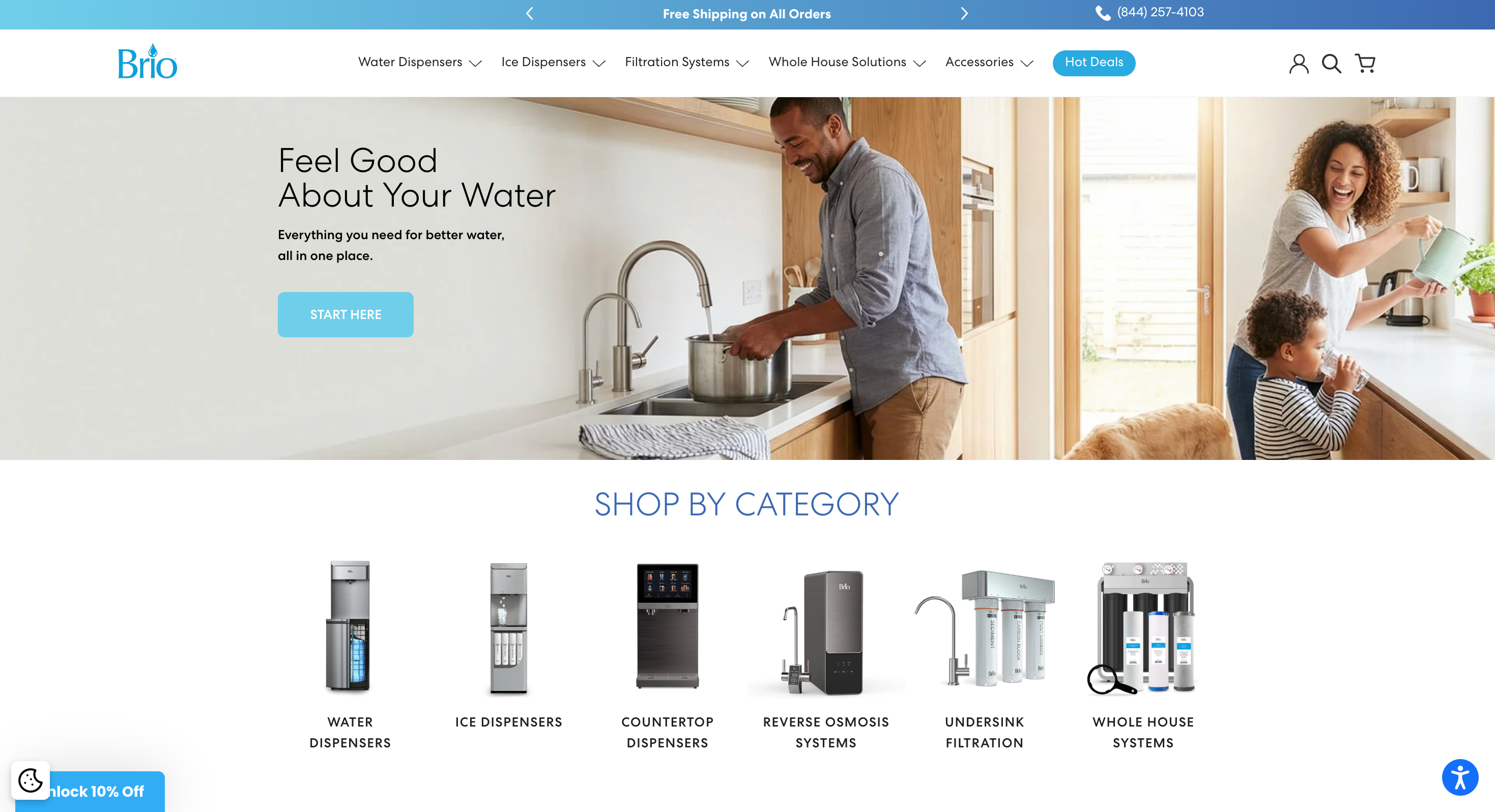
Brio came to Avex after a difficult experience with a previous CRO agency. Most of what had been built was broken or didn't function as the intended, and the program had stalled. Their goals were straightforward: get back to running a serious, ongoing testing program focused on outcomes, not troubleshooting. Within the first year, a third of all experiments run were implemented directly to Shopify, and the program generated roughly $445K in incremental revenue.
This test was one of the first we ran when the program launched. It's a case study in what "quick win" actually means when it's grounded in behavioral data rather than guesswork.
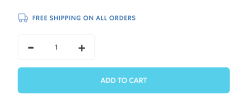
The test: Adding a free shipping callout directly above the Add to Cart button on PDPs. Brio offered free shipping on all orders, but it was only visible in the announcement bar at the top of the page and in the cart after adding a product.
The Results:
+12.90% add-to-cart lift (96% significant)
+3.76% increase in purchases (70% significant)
Why it worked
Before this test, the free shipping message lived in the announcement bar at the top of the page.
Baymard Institute research documents what practitioners see in session recordings regularly: users develop near-total blindness to global page elements like announcement bars and header banners. By the time a shopper is evaluating a product on a PDP, they are not mentally registering a message that sits above the navigation.
Moving the free shipping message to directly above the cart button placed it at the exact moment a purchase decision is being made. Same information. Different location. Add-to-cart lifted 12.90% at 96% significance.
This was one of the first tests we ran when Brio launched their CRO program. It's a useful reminder that quick wins are not the same as trivial wins.
The broader principle: Where information appears on a page matters as much as whether it appears. Placement relative to the decision point is a conversion variable in its own right.
How a Price Looks Changes How Expensive It Feels
Client: ALASTIN Skincare | Industry: Premium Skincare | CRO program: 3 years
ALASTIN's products sit at a higher price point than most DTC skincare. That's justified by clinical efficacy, physician backing, and ingredient quality, but it means price is an active variable in the purchase decision in a way it isn't for a $30 moisturizer. Their CRO program had already surfaced an unconventional finding: hiding price entirely on collection pages increased conversion, because users who saw a price before engaging with the product were more likely to bounce before understanding its value.
This test pushed that hypothesis further, asking whether the way prices were visually displayed on PDPs was also creating unnecessary friction.
The test: Removing ".00" decimal places from whole-number product prices across PDPs. No price changes. No discounts. Just a cleaner display of the number already there.
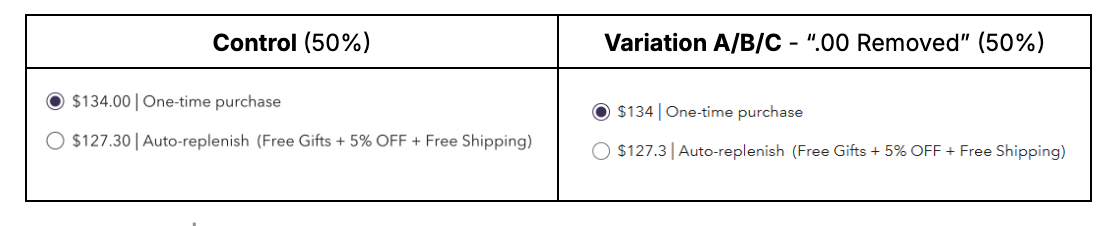
Results:
+3.93% purchases (98% significant)
+4.71% revenue (99% significant)
+2.77% Add to Cart (99% significant)
Significant lifts across all intent levels.
Why it worked
Pricing psychology in eCommerce tends to focus on anchoring and charm pricing. Less discussed is the visual weight of how a price is displayed, which influences perceived cost independently of the number itself.
Research on price cognition suggests that longer price strings are processed as more expensive, even when the underlying value is identical. "$158.00" reads as heavier than "$158." The decimal and trailing zeros add visual complexity that activates more careful price scrutiny. For premium brands where justifying price is part of the purchase decision, that extra scrutiny is a conversion barrier.
ALASTIN had already validated through prior testing that hiding price on collection pages increased conversion. This test extended that logic to the PDP level.
What made the result particularly strong: the lift held across low, medium, and high-intent users simultaneously. Tests that produce significant results across all intent segments are strong candidates for global implementation, because they're not dependent on a narrow audience condition.
The broader principle: For premium and luxury brands, reducing visual friction around pricing is a strategic lever. It doesn't lower the price. It removes noise that makes the price feel higher than it is.
A Smaller Retention Offer Can Generate More Revenue
Client: Bonafide Health | Industry: Women's Health Supplements | CRO program: 3 years
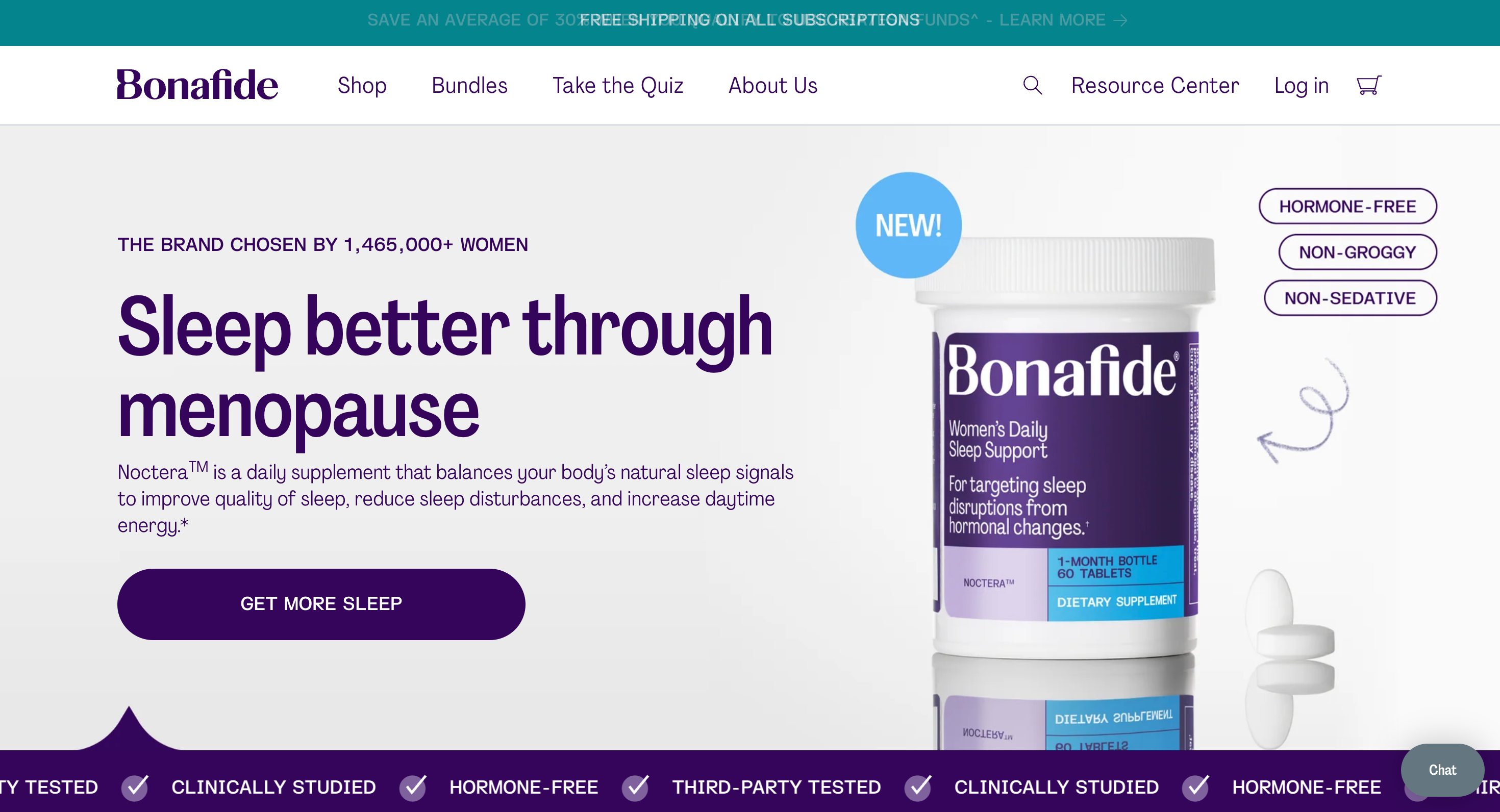
Bonafide sells a focused catalog of science-backed supplements addressing women's health concerns. Their business model is heavily subscription-driven, and their CRO priorities reflected that: grow subscription adoption, increase AOV through higher-tier recurring plans, and protect MRR without over-discounting to retain subscribers.
Over three years, Avex ran dozens of successful tests across the subscription funnel. This one stands out not because it lifted conversion, but because it improved the economics of retention in a way that most brands aren't willing to test.
The test: Reducing the subscription cancellation save offer from 50% to 30% for customers who initiated the cancellation flow. The brand suspected that some subscribers were repeatedly canceling and re-enrolling just to lock in the 50% discount, effectively turning a retention mechanism into a routine discount channel.

The Results:
Cancellations up just 4.67%
Discount depth down 40%
Revenue per retained subscriber up 20% of list price
Why it worked
The hypothesis was not that fewer people would cancel. The hypothesis was that the revenue gained from reducing discount depth would outweigh the revenue lost from the marginal increase in churn.
That's exactly what happened. Cancellations increased by 4.67%, which was directionally expected. But the 40% reduction in discount depth meant each retained subscriber generated meaningfully more revenue per shipment. The higher flow abandonment rate (up 10%) points to habitual discounters who found the lower offer not worth pursuing and stayed on full price rather than following through with a cancellation.
The 30% offer became the default.
The broader principle: A CRO program that only optimizes for conversion rate is leaving revenue on the table. Discount structures, retention offers, and post-purchase flows are all testable. The analytical framework is the same: form a hypothesis, run a clean test, measure what matters.
Removing a Feature Can Increase the Purchases It Was Meant to Drive
Client: LoveShackFancy | Industry: Apparel (Fashion) | CRO program: 2 years
LoveShackFancy is a premium fashion brand with a strong aesthetic identity and an equally strong base of aspirational shoppers: people who love the brand, browse frequently, and convert at a lower rate than their traffic volume would suggest. Their CRO goals centered on improving conversion and revenue per user without compromising the editorial feel of the site.
Over two years, Avex ran roughly 40 experiments across the site, validated a major navigation redesign, and generated approximately $7M in direct revenue through personalized product recommendation campaigns. This test is a good example of how understanding your specific customer behavior leads to a hypothesis that looks counterintuitive on paper but makes complete sense once you examine who is actually on the site.
The test: LoveShackFancy had been considering a redesign of their quick view feature on PLPs. Before investing in that build, we ran a simpler question first: does quick view help conversion at all, or does it actually work against it? We tested hiding the quick view option entirely, requiring users to visit the full PDP to engage with a product.
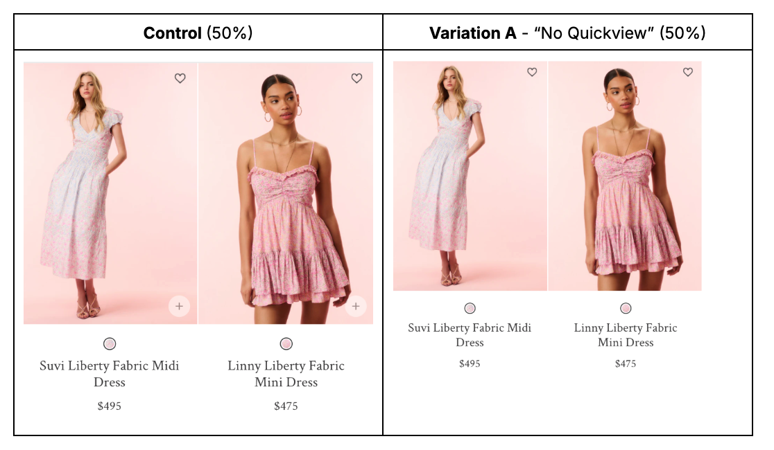
Results:
+7.7% purchases (96% significant)
+9.16% revenue (98% significant)
+2.58% product views
Add-to-cart down 3.29%
Why it worked
The result looks contradictory at first. Add-to-cart dropped significantly, but purchases and revenue both went up. Understanding why requires thinking about who quick view actually serves.
Quick view is designed to reduce friction. In theory, letting a shopper preview a product without leaving the collection page should make it easier to add items to cart and buy. In practice, for fashion brands with a high proportion of aspirational browsers, it does something different. It makes window shopping frictionless. A user can scroll through dozens of products, pop open quick views, and feel like they're engaging with the site without ever committing to a purchase decision.
Removing quick view forced users to visit PDPs to evaluate products. That extra step is friction, but it's productive friction. A user who clicks through to a full product page is making a small commitment. They're engaging with more content, more imagery, and more information. That deeper engagement increases purchase intent in a way that a quick view flyout does not.
The add-to-cart decline reflects fewer casual, exploratory cart additions. The purchase increase reflects more deliberate, higher-intent buying behavior. The same product, the same price, a more focused path to purchase.
The broader principle: Reducing friction is not always the right objective. For high-consideration or aspirational product categories, adding a small amount of deliberate friction at the right point in the funnel can shift users from browsing mode into buying mode. The question is not how to make every action easier. It's which actions, when made slightly harder, lead to better outcomes.
The Pattern Across All Five Tests
The five tests in this post span four brands, three industries, and dozens of individual learnings. What connects them is not the size of the changes, but the rigor behind them: behavioral data generating a hypothesis, a clean test validating it, and a clear decision made on the result. Repeated consistently over months and years, that process compounds into material revenue.
None of these tests required a redesign or a new platform. They required knowing where to look, what question to ask, and the infrastructure to answer it correctly.
If your site is generating traffic and you're not running a structured testing program, you're leaving measurable revenue on the table every month. Avex builds and runs CRO programs for premium DTC brands on Shopify, from test strategy and execution through to personalization and implementation. If you're ready to find out what's already in your data, get in touch.